Wow, what a full week working on 2 online art courses, embracing vulnerability, acknowledging imperfection, pushing through disappointment, seeking to find a playful, free attitude towards creativity, and learning lots of new techniques and supplies!
As guided by my word choice/intentions/focus for the year (thrive and harmony), I’ve tried to harmonize my efforts this week working through lessons from 2 online art courses (10 videos in all!), ‘A Year of Painting’ by Alena Hennessy (I was blessed to be one of the five random winners from her drawing for a free class and am extremely grateful!) and ‘Life Book 2015’ by Tamara LaPorte (and guests!). I wanted to document my experience and take notes about what I’ve learned from the classes so I thought I may as well share here in case anyone would like to follow along. It takes a bit of courage to share the disappointments along with the seemingly more successful creations so please be kind. I know some of it isn’t beautiful from a viewer’s perspective, but it is all valuable and beautiful as a learning experience. I want to share both in hopes that it might encourage others to push through and keep playing/practicing/trying if they want to make progress and improve skills, whether in art or some other aspect of life.
First, I completed my version of the ‘letter to the new year’ suggested by Alena. I thought about it while in the shower and then put keywords and ideas down on paper (more like a brainstorming session than a typical letter, but this is what worked for my chaotic mind).

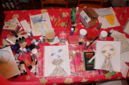
Then, I dug out some supplies from storage in the basement (while the room where I hope to claim a creative space is under construction) along with several scraps of paper and took over the dining room!

I worked interchangeably through the actual lesson from a year of painting and the creative warm-up for life book. I struggled through the year of painting project using paper shapes in a way I had never done before. The intuitive aspect didn’t seem to be flowing at first. Finally, I cut off almost half of the piece I was working on and replaced it with other paper and came to a finished piece that felt much better. I noticed areas with similar shapes to some from the brainstorming notes and put emphasis on those. I also chose to incorporate the heart and flame shapes that remind me of the heartlight shape that seems to be reaching out to/through me.
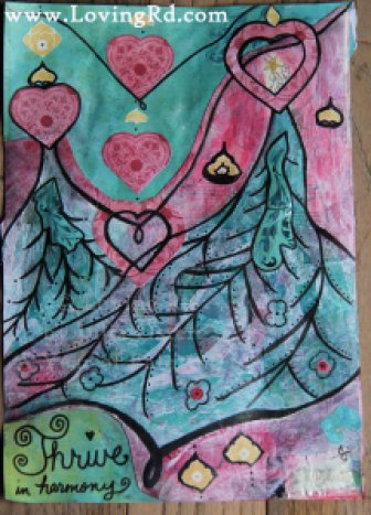
The Life Book creative warm-up went much easier for me and I really enjoyed playing with paint and techniques to make a cool background. I used mostly scraps of paper from a ‘crumb bag’ (as a previous teacher once called it – a bag kept around for random bits and pieces) for the collage part. The color palette was driven by the 2 new paints I got (for myself) in my stocking. I chose to fill the envelope with the notes from the brainstorming done earlier for the other class since it pretty well captured my intentions/goals for the year (which is what we were supposed to list in the envelope) and it feels like a sort of prayer with hopes/intentions. This page ended up taking a few days to fully finish!


After completing most of it one day, that night the vision of the words on prayer flags came to me. The next day, I found some scraps of fabric and an old guitar string (from my kids’ toy guitar) to hang the flags from. I love the symbolism of using the guitar string since one of my words for 2015 is harmony. 🙂 <3 I wrote the words I chose for the year on the prayer flags along with the heartlight symbol that I’ve been doodling for a few years. Some of the fabric was saved from my mom’s old clothes. The lace (from my grandmother’s clothes – yes, I save too much perhaps!) was in the bag of fabric scraps and really wanted to be incorporated as a border of some sort. I decided it looked a bit like a curtain when held up to one corner and that led to framing around the top. It reminds me a bit of a window now and could be seen as a little window into/from the soul looking out onto the prayer flags in the rain. I felt compelled to add a reference to rain (even before Tam’s lesson with the drip technique) to represent dancing/thriving even in the rain (which is, after all, necessary for nature to thrive) and because it was in the shower that the initial prayer/meditative time took place.
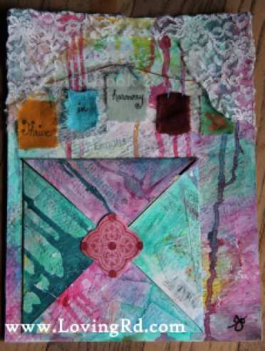
In addition to these 2 classes, I am still trying to participate in the Documented Life Project (DLP). Joining the documented life project last year was one of the actions that really took my art up a notch and also introduced me to a whole online tribe of art friends. I am forever grateful for the impact that participating in DLP has had on both my art and my heart! <3 Thankfully, some of the lessons from classes may be able to go along nicely with the new 2015 DLP challenges! Week 1 for DLP 2015 was about “The Blank Page and How to Face It!”, the Art Challenge was Book Paper and the Journal Prompt was Be Your Own Goal Keeper. I think the above page did all of these quite well (fun techniques to get over the blank page, book paper collaged in first layer, intentions/goals inside the envelope) and I love the synchronicity! 🙂
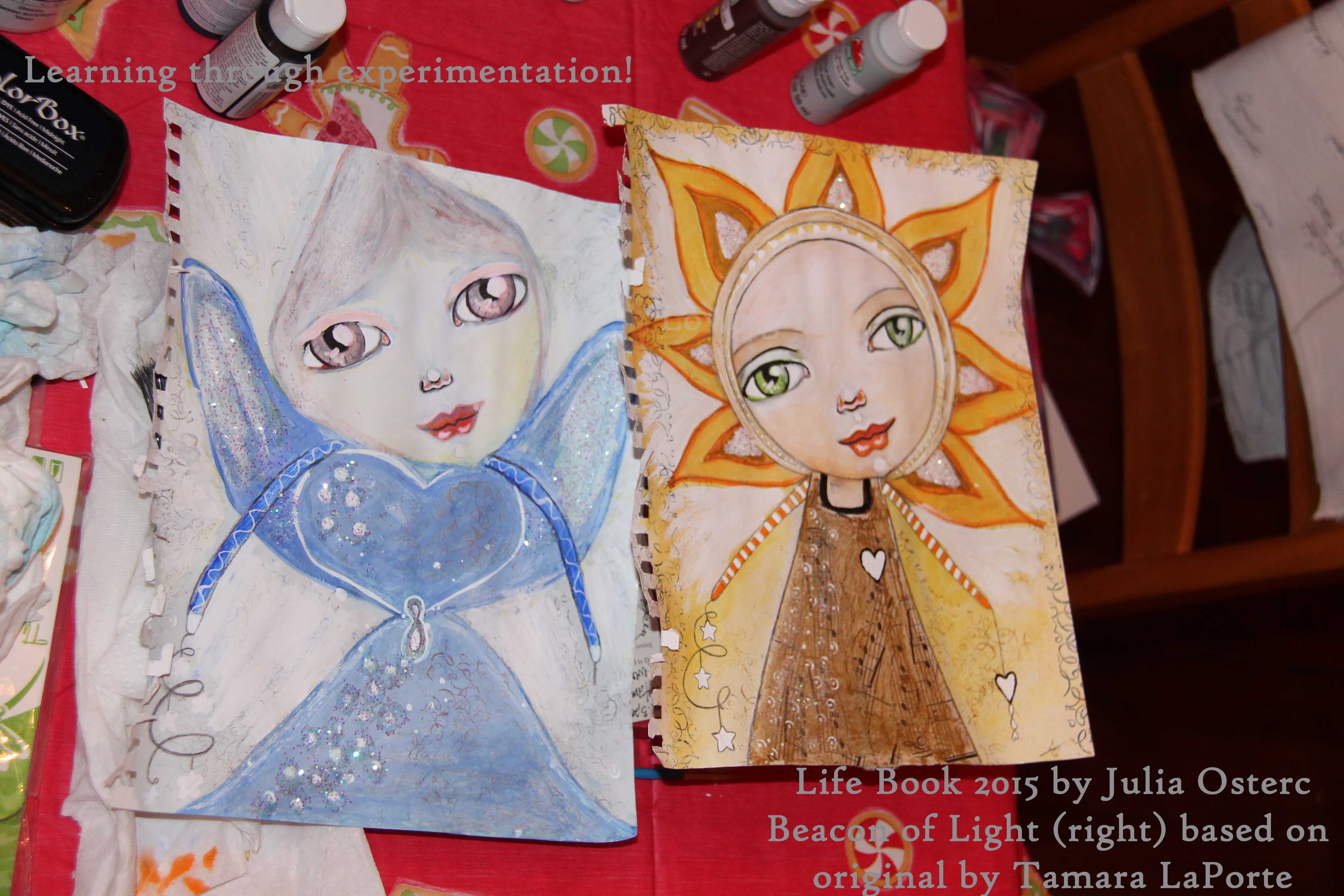
Moving onto the main lesson for week 1 in Life Book, I decided to go along with Tam in the video and pretty much copy her painting, with minor changes here and there, to ensure that I would try all the aspects of the lesson without missing anything. I had to improvise with different supplies because the neocolor water-soluble crayons I ordered hadn’t arrived yet. Thankfully, I had some inktense blocks that work similarly. I was pleasantly surprised by the final result! 🙂
![]()
Yet, I really wanted to also capture the essence of the guiding light that feels more personal to me. As shared in prior blog posts, this vision/shape of angelic heartlight has been with me for a few years now.
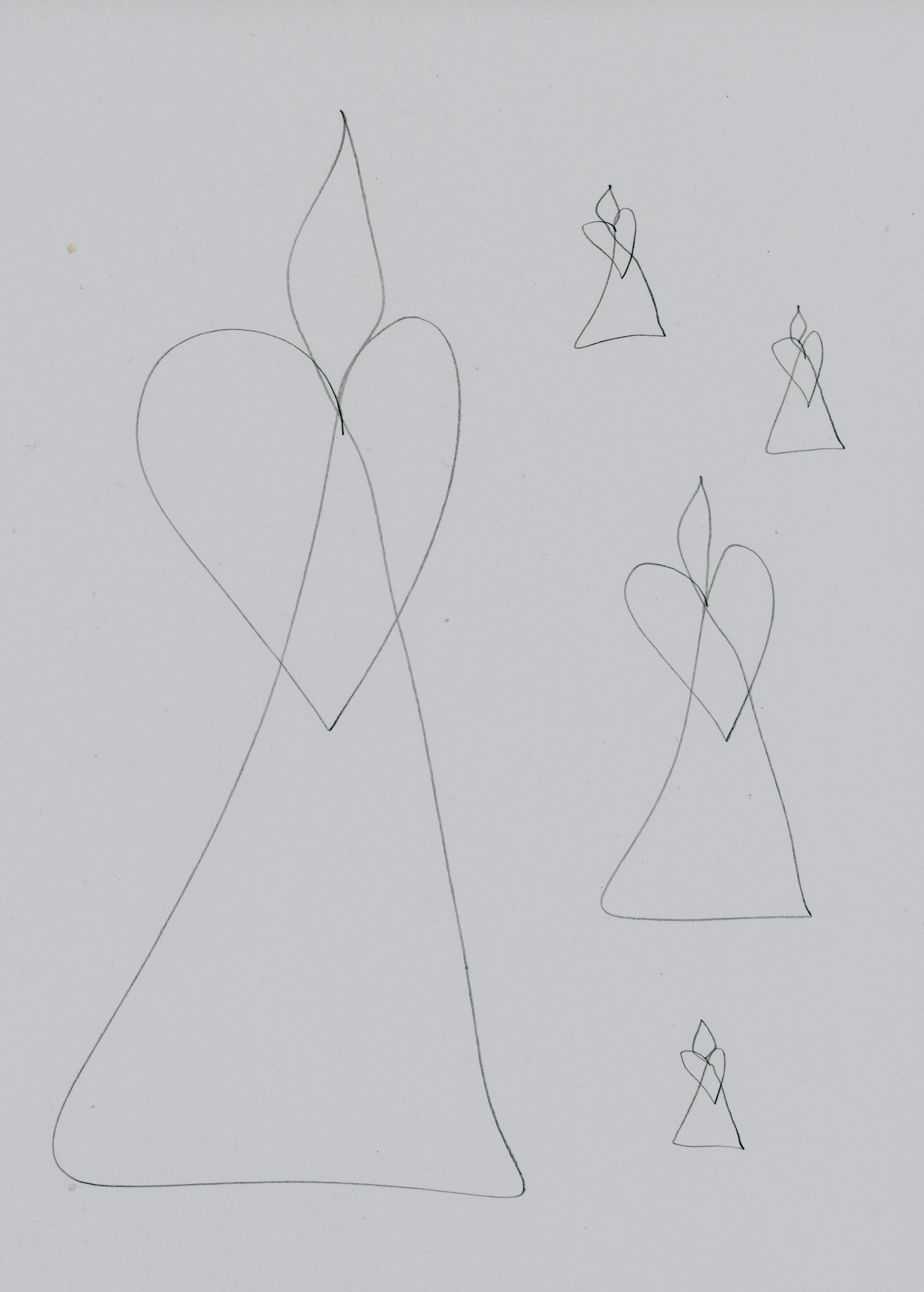
I tried to adjust the shape slightly for the lesson, tilting the head/flame, and enlarging the flame/head. I learned the importance of what type of paper is used when I attempted to paint a rough sketch done on paper that was not heavy enough and the watercolor wouldn’t even activate and the paper was about to fall apart (far left in photo below).
So, I had to draw it all over again. I felt strongly that the blue and purples seen in flames in a fire should be the main colors. However, I got more and more disappointed as I worked on the first version and it wasn’t seeming to communicate the right essence at all! My husband said it looked like an alien (which I suppose it is). However, it definitely looked too much like the commercial ones by the time I gave up on it! I tried changing the color several times hoping that might fix it. The blues kept seeming too icy and reminding me of Frozen and Elsa instead of the warm flames of fire I envisioned. The eyes were way too big, the cone shaped head didn’t seem like the candle flame I intended at all. As the frustration grew, so did the impatience. I rushed to add glitter too soon… what a mistake! It stuck in places I didn’t want it due to wet paint and made a huge mess. I tried to paint over the glitter in the flame area where I was still unhappy with the color (I painted this so many times that I lost count) and it looked awful! I thought maybe it needed a bit of yellow to try to warm it up. Oh no, yellow and blue make GREEN! Ugh… hello, alien. 🙁 I was probably too impatient and some of the paint wasn’t dry… or it might have been the (wrong color bright teal blue) tombow watercolor marker that kept re-activating no matter how hard I tried to get rid of it or paint over it. I was finally about ready to give up. I tried a new sketch and found that I liked it much better. I realized then that the proportions of the first sketch were all wrong and even if I had gotten the colors right, it wouldn’t have fixed it. The eyes were way too big and never felt right andthe arms were coming out of the wrong area all together like coming out of where the neck should be above the shoulders! Time to finally stop and let go of that one, with respect and gratitude for the lessons she taught me, and move on.
The second sketch felt much better and more proportional.

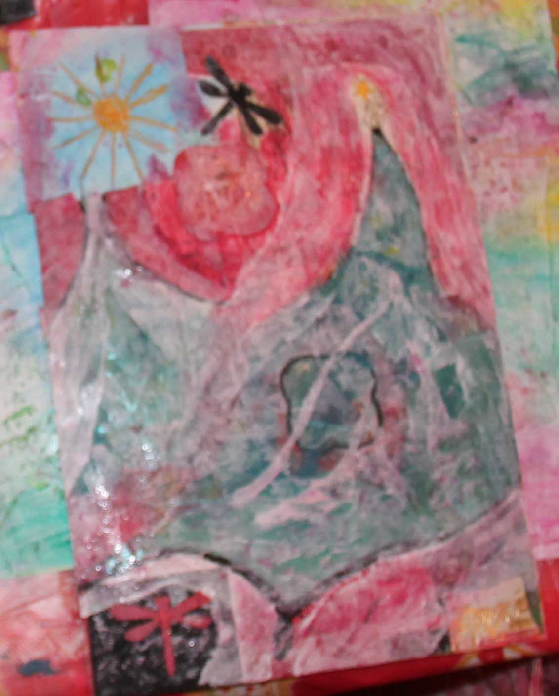
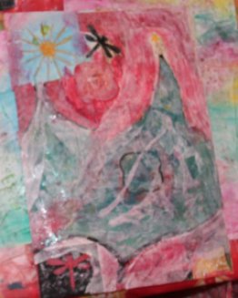
Yet, when the hand reached down to grasp the hand of another (I don’t know why or where that idea came from… it just did), I realized I’d rather have her head tilted (like in Tam’s lesson/original with her beacon of light) toward the hand. I had already done the shading on the face and gasp, was actually kind of happy with it! Still, I decided to try a new sketch before getting further invested in this one. I definitely liked the 4th version/sketch the best so far. I had been studying the fire in our wood stove in between sessions (this took place over a few days!), and decided to try having multiple flames (which is not true to the shape/vision as I’d seen it thus far, but I had always had nice long hair to avoid the cone shape of the flame for the face in other angels). I tried using all the fire colors at once with the neocolor crayons that had just arrived… duh, warm and cool all wet together equals some shade of brown! So had to start the coloring over after it finally dried a sandy color and alternate between warm colors, then dry, then cool colors, and opted to use the acrylic paints I’m more comfortable with knowing they wouldn’t re-activate with water. She went through a rather hell-ish phase with orange flames that was a little disturbing! I kept telling myself to trust the process and keep going. The colors finally came to a place of harmony that brought me peace. I thought that maybe the background could be a deep blue/black like darkness of space with her representing the womb of creativity (the infinity sign in her center was meant to represent a womb in the sketch). I tried using a dark blue inktense block and it wouldn’t fully blend. I chose to embrace the look (and lines) and it inspired a wish to have a background that seemed similar to the amazing space images I’ve seen. While working on a different project (actually starting week 2 of Life Book) using spray inks, I pressed the corners of this piece into the inks and got a cool effect. The stars in her hands represent the cosmos and all of creation/existence. Stars also have special significance to me (as shared in a different blog post) in memory of my mom and appear in a lot of my art. Her other hand just seemed to be wanting to hold the hand of someone reaching up/out to her. I later wished her eyes had been looking at the hands (though I don’t know how to achieve that yet!). The shape where her heart would be is my signature. I use my initials, J.O., in a way that reminds me of a dragonfly (which has very special meaning to me in memory of my mom as shared here, scroll down to the story of the dragonfly). Placing my signature in her heart felt like acknowledging my place in her heart, that she (Being/Source/God/Creator/Guardian/Spirit) would always have me in her heart. It could also represent the divinity within myself, that is in all of us. I heard the words ‘pure energy’ (as in this song) repeat through my head a few times while working on her. I think the infinity symbol for her womb holds a pure energy that is the life force of existence. Yes, I know I think too much and have an overactive, analytical head. Art is one way I try to find balance and harmony between my head and my heart. <3 Even if not intending to, it seems most of the art I create has some form of symbolism in it.

The version with the flame head looking straight ahead kept calling to me to seem to want a chance to be finished so I’ve worked on both through-out a couple of days, working on one while the other was drying and vice versa.
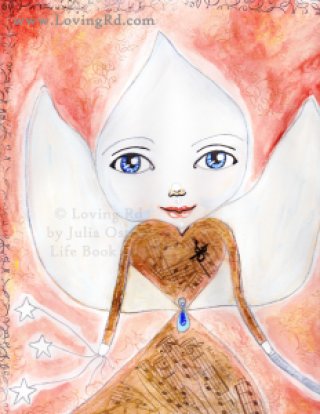
Neither feel quite finished yet… still seeming to need all the little finishing touches and details like Tam mentions. They may get some glitter along with other highlights and details, but I wanted to go ahead and share while I could find the time to write this and they were in a dry enough and close enough state to scan (unfortunately, the scanning bed was too small to capture the entire images). Plenty of room for improvement and looking forward to doing so through more play, practice, learning, experimentation, and time.
Also, I wanted to share this tune for Tuesday (today) that I heard (and fell in love with) for the first time while working on these. Shine by Jason Mraz It seemed almost as if a message from the angelic being I was working on! It also felt as if it could be a message from those that have gone before us into the mystic that is heaven/beyond. One of my friends lost her mom this week and I’ve tried to be there for her, re-visiting the experience of losing my mom to reach out to her. Maybe they are singing together and shining their loving light on us.
This has all taken place over several days and my husband and kids probably think I’m crazy! Yet, to my joy, they all joined me at some point and made art of their own. 🙂 A nice little bonus effect from bringing all the supplies up from the basement to the dining table.
When I first started working on the intention brainstorm piece, my husband asked if what I was doing was my ‘homework’. That was probably the first time he’s ever referred to time I spend making art as ‘work’, which was actually a great thing because it meant he respected the time needed to ‘work’ on it! This has been an unexpected benefit of taking these classes. 🙂 Supposedly the rest of the weeks won’t be as jam-packed as this one for Life Book, which is probably a good thing because I don’t think I could fit this much in usually. I have been amazed by the quality and quantity of lessons already packed into the first week of Life Book. I was hesitant to buy the class for a few reasons. I am so very glad I decided to anyway! I used a bit of money my mom had left me when she died in 2010 to purchase the Life Book 2015 class so this is kind of a gift from her. 🙂 <3 I can tell just from week 1 that this is going to be an awesome class and well worth the price (and then some!).
Here’s to learning with the hands, the head, and the heart! <3


PA Pict
Fabulous work and a great start to a new year of creativity.
lucy
Love All your different versions Julia! ?
Misty
These are turned out so amazing!!!!
Minerva Levinston
so lovely Julia..!! love your heart light flame angel.. she is glowing…cant wait to see it once you’re finished with the details :)) {{xx}}